Wallit Announcement and Brand Story

by Mike Vien
Posted on
05-13-2019
Introducing a new everything.
Today, we’re launching a new name, logo, and brand.
Over the years, we’ve evolved and grown tremendously as a company. Along the way, our vision for the future of finance has become increasingly radical, and increasingly clear. We needed a name and a brand that could grow with that vision and help bring it to life.
The Name

With that, we bring you Wallit.
The name “Wallit” reflects our belief that the wallet is no longer simply a place to hold money and cards. It is becoming the center of how we spend, save, earn, connect, and move money through our everyday lives—and, ultimately, how we participate in the financial system.
At the heart of Wallit is Continuity: helping people establish, maintain, and increase their participation across organizations and life transitions over time.
We believe the greatest opportunity is not simply to bring more people into the financial system, but to help them stay connected and engaged once they’re there—to increase participation, preserve participation, expand participation over time, creating a continuous relationship between people, their money, and the organizations that serve them.
We’re reinventing the digital wallet as a platform for that continuity, so it felt fitting to reinvent the spelling of the word as well.
And frankly, as a startup, domain names and trademark lawyers are expensive, and we could think of about 200,000 better ways to spend our money right now.
The Logo

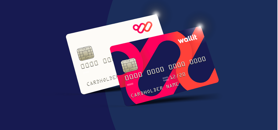
The Wallit mark incorporates three interconnected shapes that symbolize the connection between Wallit, our customers, and the communities we serve. The three circular forms are intertwined to represent how Wallit creates a better, faster, more streamlined way for families, banks, brands, and merchants to connect.
Circles have no beginning or end. They move without restriction, representing speed, energy, and power. At the same time, their boundaries create a sense of safety and security, protecting what is inside.
Together, these elements form a unique, stylized interpretation of the letter W. A traditional “W” has a beginning and an end, but our mark does not. Instead, it is fluid and represents continuity, interconnectedness, and perpetual movement, much like the moments that make up our everyday lives and our relationships with one another and with money.
Each individual shape, as well as the mark as a whole, moves upward and to the right, signaling growth and our forward-looking approach to financial inclusion. It also represents our role in a larger global movement toward digital money that is always in motion.
The Colors
The colors symbolize the release of energy, idealism, experiences, and human potential that come together at Wallit, with Continuity as the catalyst.
One of the primary frictions we aim to help people overcome is inertia. Too many people simply aren’t saving, or don’t know where to start. We want to help them take that first step—and take it now.
People want to spend money, save money, experience life, and build their futures. We chose red as our primary color because it is bold, energetic, and action-oriented. Red creates a sense of urgency and excitement—exactly the energy we want Wallit to bring to people’s financial lives.
At the same time, one of the biggest challenges for organizations is staying engaged with their customers while brands and merchants compete fiercely for consumer attention. Wallit bridges these needs.
Most financial organizations choose green or blue as their brand colors. We wanted to own a distinctive color and visual style so that our company and products could stand out among the many applications and icons competing for attention in an already crowded marketplace. Research has also shown that shoppers respond particularly well to red-orange hues.
Rayleigh Red is a vibrant blend of red, orange, and pink tones inspired by the colors that can fill the sky at sunrise and sunset. We named it in honor of British physicist Lord Rayleigh, whose work provided the scientific explanation for Rayleigh scattering, the phenomenon that helps explain the spectacular colors of the sky.
We chose Rayleigh Red to make Wallit instantly recognizable while expressing the personality we want our brand to embody: youthful, energetic, optimistic, and friendly.